Archive for the 'translation' Category

Manga Criticism Translation: “At First, I Wanted to be a Manga-ka”: Analyzing the Nausicaa Manga by Kumi Kaoru, pt 2 now up at Ogiue Maniax!

Friday, March 5th, 2010

Perhaps you remember seeing a post made on this blog a number of months ago, “Manga Criticism Translation: ‘At First, I Wanted to be a Manga-ka’: Analyzing the Nausicaa Manga”, a translation of an analysis of the Nausicaa manga by Kumi Kaoru . Perhaps you didn’t read it, perhaps you did! Either way, I’m happy to announce that the second part of the translation has been posted up on Ogiue Maniax for all to read!

I will hopefully actually be updating this blog within the next week with an actual article, so stay tuned here, too!

Garo 1965 Title/Author Listing + Notes

Friday, January 29th, 2010

I was going to write about the copy-bon I bought at C77, but then I realized that no one is actually interested in that. On the other hand, a small handful of people are interested in Garo, so I felt that it’d be a better use of my time to write up another year of Garo information! If you missed my post on Garo’s 1964 issues (I don’t blame you, it was almost 8 months ago), it can be found here. Once again, names will be in the format of Lastname Firstname, and individual stories in each issue will be listed as Author, “Story”. Also once again, many thanks go out to Shiraishi-san for allowing me to draw from his Garo index, though his site currently appears to be offline. I am fairly sure that the works listed under each month are not listed in the order which they appear in the magazine, but the order they appear in the table of contents on the back side of the front cover.

(more…)

C77 Acquisitions (kind of): Manga Ronso Boppatsu Vol. 1

Friday, January 22nd, 2010

After some twitter back-and-forths, I’ve decided to try to do a few posts where I introduce some of the stuff I picked up last Comic Market (C77), mostly just to prove to people that you can spend over $500 on interesting doujinshi and have basically none of it be pornographic. (Nozomu Tamaki pushed his ero book on me and who am I to deny that man a sale?)

Of course, to start off this series of posts, I’m going to basically mess up my entire theme by starting with a professionally published book from 2007. I did, however, purchase this book at C77, and it’s the closest one to my laptop, so I’m going to start with the first volume of Manga Ronso Boppatsu (マンガ論争勃発, “Manga Debate Eruption”, alternatively “The Manga Criticism War Erupts!”), authored and edited by Kaoru Nagayama, author of Eromanga Studies (East Press), and the journalist Takashi Hiruma.

Manga Ronso Boppatsu is a collection of nearly fifty short (2-6 page) articles on a variety of topics, most of which center around a single expert or critic’s thoughts on the topic at hand. The authors of the book state that the idea behind the book is to listen to various positions on each of these hot topics, such as the globalization of manga, creators’ rights, and the limiting of free expression in manga, so that constructive discussion can start taking place rather than the mindless, polarized shouting matches that’re all too easy to fall into when debating these issues.

I ended up getting this book (and its sequel) thanks to a tip from Vertical’s Ed Chavez, who sent me off in the direction of the far-left corner of the Big Sight’s East-3 hall, where I found a rather large table staffed by just one guy, who I assume was one of the authors of the book. The placement of their booth was a bit odd to me, as it was down in one of the doujinshi-selling halls (as opposed to the upstairs industry hall), but up against the wall where non-doujinshi products like markers and corn dogs are sold.

This was actually a rather appropriate place to stick these guys, as while their book is released by a professional publisher (Micro Magazine), the subjects covered in the volume either deal directly with doujinshi events like Comiket, or are extremely relevant to the ideals embodied by these events themselves: Spreading manga culture and providing a space where individuals can distribute works of free expression. I’m not just making this stuff up, either–the Comic Market Preparation Committee and the National Doujinshi Event Liaison Group are both prominently given credit for cooperation right next to the authors.

I mentioned that Manga Ronso Boppatsu is the closest book to my laptop, and there’s actually a reason for that; it’s basically the only thing I’ve been turning to as of late when I feel like educating myself on manga. While I’m still working through it, the articles I’ve read so far are all very informative and provide thoughtful views on whatever topic is at hand. Of course, there is a trade-off to gathering the breadth of experts that the book jams into a little over 200 pages, and that is that a relative lack of depth in any given article. However, the articles are all excellent primers on their respective topics given by some of the most respected individuals in their fields. Since it’d be nearly impossible to give my thoughts on each individual article, I’m simply going to spend the rest of this post below the cut translating each article’s title and the primary individual consulted or interviewed (when applicable), and strongly suggest the volume (available for purchase at Amazon and bk1.jp, among other places) to anyone with an interest in a mix of solid journalism and on-the-ground, current commentary on the state of manga and doujinshi.

(more…)

Manga Criticism Translation: “At First, I Wanted to be a Manga-ka”: Analyzing the Nausicaa Manga by Kumi Kaoru, pt 1

Wednesday, November 4th, 2009

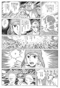
Translator’s/bloggers introduction: Some time ago, I received an email from Kaoru Kumi, a freelance writer in Japan who had read the coverage of my blog post translations of Kentaro Takekuma’s lectures (1, 2), offering the opportunity to translate portions of the anime scholar’s extensive book on Hayao Miyazaki, Miyazaki Hayao no Jidai (The Age of Hayao Miyazaki), written in the school lecture style, that contained Kumi’s own in-depth analysis of the Nausicaa manga as well as an engrossing examination of a often-used but rarely-explained term used to describe manga.

Kumi's book, Hayao Miyazaki no Jidai (The Age of Hayao Miyazaki)

Kumi's book, Hayao Miyazaki no Jidai (The Age of Hayao Miyazaki)

Since I’ve been busy as of late, I received Kumi-san’s permission to split the translation duties with SDS of Ogiue Maniax, where the second half of this translation will be posted.

I’ve tried my best to keep formatting simple, with underline used for titles, italics used for unusual Japanese words that were kept untranslated, and (Firstname) (Lastname) for Japanese names. I’d like to thank Kumi-san for giving me this opportunity and working with me throughout the translation process. Also, if you have any comments or questions, as always, please let me know.


Here we go, boys and girls. (laughter) Today, I’ll be talking about my analysis of the Nausicaa manga. Not the movie, the manga. The manga was a long-running series, brought into the world in January 1982, and completed in ’94. I’ve already discussed why Miyazaki started working on this project, so I can skip talking about that today… Or so I’d like to, but if I did, I’d surely see some confused faces, so I’ll tell you about his career as a manga artist before Nausicaa.

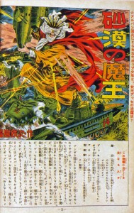
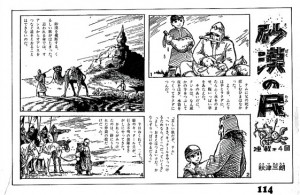
As I mentioned earlier, Miyazaki wanted to be a manga creator when he was in his teens. There’s an interview with him where he reflects on that period of his life, and I encourage anyone interested to find a copy of it (( “Kaze no Kaeru Basho” (The Place Where the Wind Returns), interview by Youichi Shibuya for rockin’on)) . Miyazaki has a number of pleasant anecdotes about this period; when he was a senior high school student, he was shocked when told that his own designs and stories were copycats of Tezuka’s manga, and so he burned all his manuscripts, or about the only time during university he brought his manuscripts to a tiny publisher, but was too shy and nervous to ask them to comment on his manga. He says that he had hardly opened the door before he had left the office. His talent bloomed while at Toei Doga, after graduating from university, in the latter half of the ’60s, during which time he published two obscure manga works while he also lead a busy life as an talented animator. The first is Sabaku no Tami (The Desert Tribe), a manga–or more accurately, an illustrated story ((E-monogatari/絵物語))–serialized in Shonen Shojo Shinbun, a weekly children’s newspaper, ((Launched in December 1968 as 少年少女しんぶん, published weekly. Changed its name in March 1970 to 少年少女新聞. Ceased publication in March 2004.)) after he worked hard on Toei’s animated feature The Adventures of Horus: the Prince of the Sun was completed in 1968. ((The title ran from September 1969 to March 1970 under the pen name Saburo Akitsu)) I’ve come across this work on the internet once, and what struck me was how cinematic its image composition is. The story is kind of like if the Pejite tribe from Nausicaa became its main characters. The serialization was cut short mid-run, and the work has never been republished, meaning that the title remains a very rare one. The other work is his manga adaptation of Animal Treasure Island. Only a bit of this was available in a book, and furthermore I was only able to look over it briefly, but this too struck me really as a manga movie. He left Toei Doga after this period.

This was the only experience he had with creating manga up to 1982. Finding out that Animage wanted to have him draw a long series must have troubled him somewhat. There are stories of him repeating many times, “Hmm, I still haven’t got the knack of the syntax of manga” as he was drawing the first chapters. In fact, he would say that he was not sure he was able to draw manga fully with pens. You know, animators use pencils when doing line drawings, right? Being so used to working with pencils meant that he didn’t know how to fully use G pens or ball pens. During its early chapters, except for chapter one, there are actual instances of him using a pencil to draw the manga. Of course, this is while he was working on the television series Sherlock Hound (1982), meaning that he was very short on time, forcing him to submit his completed pages in pencil, not having used pen and ink. Once he left the production team of Hound, he returned to using a pen.

In Hayao no Shigoto, I did an analysis of the Nausicaa manga which garnered quite a response from my readers, but I’m actually not satisfied with my analysis. I mean, while I did tackle the composition of the story, I didn’t tackle any sort of visual analysis from a technical point of view. While manga criticism was once focused just on themes and ideology of the narrative, a form of criticism which adds to that approach by looking at the actual lines on the paper to understand the author’s thought process and the manga as pure image has come to the forefront since the ’90s in the Japanese manga criticism community. You all must know the television program Manga Yawa, on NHK sattelite? On the show, Professor Natsume has a segment where he does manga analysis called “Natsume no Me” (Natsume’s Eyes). Analysis like what he does. I’d been thinking for a while, “I wonder if he’ll ever do Nausicaa…” Incidentally, he still hasn’t done a segment on Nausicaa. Allegedly, Miyazaki won’t OK it. What a narrow-minded man! (laughter) Well fine, if the NHK won’t do it, I will! And with that, I’d like to talk about my technical analysis of the Nausicaa manga.

As soon as the serialization of Nausicaa began, manga lovers began to praise it highly. It seems like the two things you heard the most about it were “it’s quite cinematic” and “its style is dense and hard to read.” This is the opinion of someone who read the manga before watching the movie, and I felt the same way when I read the manga for the first time after seeing the movie.

Putting that aside, what exactly does “cinematic” mean, anyway? You heard the same term applied to another work that began during this period, Katsuhiro Otomo’s AKIRA, even praised as such by the man first said to create “cinematic manga” in Japan, Osamu Tezuka–though in the last 10 years of research, talented scholars have made discoveries leading manga critics to conclude with certainty that “cinematic” techniques were being used in manga before Tezuka began creating cinematic manga. But what does “cinematic” mean? You can’t pin it down. While there are a number of definitions given by a host of manga researchers, none of them sit well with me. To put it bluntly, they’re all functionally useless definitions. Well, there are some ones which are specific and pointed, but there’s always something wrong with them. “What exactly makes a manga ‘cinematic’?” I’ve always suspected that the text that can answer this question is Nausicaa. So finally, I’ve found a way to bring the answer to you, today through my technical analysis of this superheavyweight title. How smart I am, huh? (laughter) Today will be the first time that I reveal this method of analysis in public, so prepare yourselves.

While we use the term “cinematic” a lot, I’d like to pay attention today to the way that shots are connected to other shots. You understand what I mean? I’ve brought a DVD of 2001: A Space Odyssey ((Directed by Stanley Kubrick, produced in America in 1968 by MGM. Often praised as the pinnacle of the sci-fi genre, but Miyazaki apparently hates it.)) with me today, so I’ll explain while we watch. Why did I choose 2001 as a sample? I found the DVD on a shelf in my house. That’s all. (laughter) Just one film has hundreds and hundreds of shots joined together. (DVD begins to play) Those apes grunting on the screens are the ancestors of mankind; they’re picking grass and eating it. While this is all one shot up to here–there, we just cut to another shot, and we see another ape. We can call the filmed shots that’re tied together by an editor “edits.”

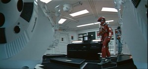
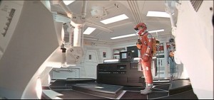
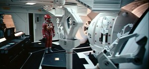
There’s four typical patterns of edits. Pattern A: Despite going from one shot to the next, the action continues to take place in the same location, and the subjects remain in the frame, allowing the action to continue uninterrupted.
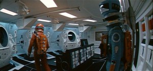
image1 1

image2 2

image3 2′

image4 3

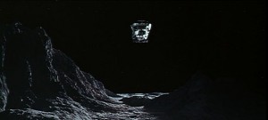
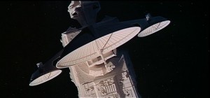
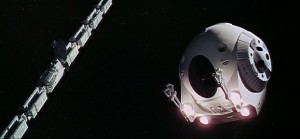
The astronaut is in the Space Pod hangar, and is about to ride a pod to go out to repair an important device of the antenna on his spacecraft Discovery (1). Look closely at the way his body moves. Even as we go from one shot to the next (2), his movements continue, totally uninterrupted. Ah, a light has turned on in the Space Pod, and something has started whirring as it moves (2′). While there’s an edit between the two shots (2′ and 3), the actors and props on screen remain the same between the two, and they continue to move in the same way, uninterrupted. This is the essential part of this kind of edit. If you still don’t comprehend what I mean, imagine a television broadcast of a baseball game. When you hear the crack of someone hitting a home run, a number of TV cameras all follow the ball. You watch the flying ball from multiple camera perspectives continuously, or uninterruptedly, on the screen. That is a typical A.

Patttern B: The setting drastically changes from one shot to the next, but the characters on screen are in both shots, and are not seen briefly during the sequence.
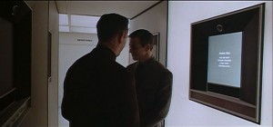
image5 1

image6 2

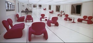
This takes place inside the space station. The man is using his voice to identify himself. Once the identification takes place, the two take their leave (1), but before they exit from the screen, there is an edit to 2. Now we’re in the space station lobby (2), see? We see the two men entering on screen a split-second after shot 1 cuts to shot 2. In shot 1, the two are passing through space customs, and in shot 2, we’re inside the space station lobby, a completely different location. The essential part of this pattern is that when we cut from one location to the next, the actors don’t appear in both in a continuous way; we do not see them on the screen for a second at the end of shot 1 or at the outset of shot 2. ((Strictly speaking, this can be divided into three patterns: exit from shot A, then cut to shot B, enter to shot B before exiting from shot A (what happens in this case), and exit from shot A, then enter to shot B. Each has their own subtle difference.))

Since the actors are unseen for a moment on the screen in pattern B, then naturally, the action is also interrupted. These men take their leave once they confirm their identities. Before the two can exit from the frame (1), there is an edit, and then they exit by walking out into the space station lobby (2). This sequence occurs in a few seconds, while the actual time to travel that far would be in the tens of seconds. Strictly speaking, we would say that the action is not continuous. However, if we look at it as movement from place X to place Y, the action is continuous in a broader sense of ‘walking from customs to the lobby’. I’ll discuss this later; this is a major point.

Pattern C: The film moves from one location and one set of characters to another location and another set of characters, turning into a separate sequence. They’re having a meeting at the moon base(1). And now we cut, and there’s the surface of the moon (2). A Moonbus is flying above the moon’s surface. The shot of the meeting and the shot of the moon take place in different places and times. Basically, it changes to a different scene. In a novel, this would be a paragraph break.
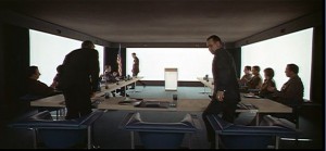
image7 1

image8 2

Pattern D: An edit from one place and cast to another, then a return to the original setting and characters, used to skip the passage of time.
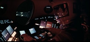
image9 1

image10 2

image11 3

The Space Pod is slowly moving through space (1). Then we cut to a close-up of the antenna (2). When we cut back to the Space Pod, we find it on standby near the antenna (3). In other words, the time in between shots 1 and 3 has been omitted. It would probably take a number of minutes for the ship to arrive at the antenna, but thanks to editing, it only takes a few seconds. It doesn’t feel like anything’s been abridged, though, does it?

These are the four typical ways in which edits are arranged. While we are so accustomed with television and movies that we don’t even notice them, these four patterns are used in almost everything from films to TV dramas. Of course, there are plenty of deviations from these patterns. Even in this film, 2001, there are sequences edited in totally experimental ways towards the end of the movie. But what I want to get across to you is that these 4 patterns are the most basic, fundamental ones there are.

Now, let’s move to the world of manga. Japanese manga is often called “cinematic,” so if that’s really true, we should expect them to be based around the four patterns above. But what’s the actual state of affairs? Let’s take a look.

Let’s start with pattern A.
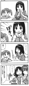
image12
Azumanga Daioh (Kiyohiko Azuma/Media Works) p.46

(Panel 2: Snap! (ぱきっ) / Panel 3: “Hehee…” (へへー)/ Panel 4: “Hm?” (ん?) “Hehee…” (へへー) “Is she that happy just because she split her chopsticks cleanly?” (きれいに割れたのが嬉しいのかな…)

This is Azumanga Daioh. A high school girl nicknamed “Osaka-san” is splitting apart disposable chopsticks. (2). In panel 3, Osaka-san turns to face the tiny girl. ((Try covering up the “Snap!(ぱき)” sound effect in panel 2, along with the lines to the left of it, then read the comic again. This places the panel into the moment after the chopsticks are broken, rather than as the chopsticks are being broken, increasing the number of actions that take place between panels 1 and 2. In other words, an action is omitted, and turns a A’ edit into a A”.)) In other words, there’s nothing omitted between panels 2 and 3. In panel 4, she’s swung around to show the girl wearing glasses how smartly she split her chopsticks. Again, there’s nothing left out between panels 3 and 4. Because manga is a medium of drawings printed on a piece of paper, we don’t actually see Osaka move, but we use our imaginations to fill in the gaps as she turns left and right. In short, this can be compared to the film pattern A. I’ll call this pattern A’ (A-dash).

There’s one more pattern, A” (double-dash).
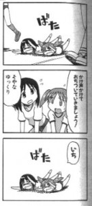
image13
Azumanga Daioh (Kiyohiko Azuma/Media Works) p.119

Panel 1: Bam! (ばた) / Panel 2: “Let’s get ourselves back together and start yelling in time!” (かけ声かけておちつけましょう!) “That’s right, let’s take our time.” (そやな ゆっくり) / Panel 3: “One” (いち) Bam!

Chiyo-chan and Osaka-san are running a three-legged race in the school sports festival. These two are well known for their rivalry, competing for the position of most and second most uncoordiated student at the school (laughter), and from the moment the race begins, they seem to be off to a good start, falling over right there. They encourage each other in panel 2, then fall over again in panel 3 (laughter). While I imagine that this sequence of panels reads quite naturally, if you think about it, there’s quite a bit cut out between each panel. I mean, you try it yourselves. After panel 2, the two have to slowly get back up, then try to start running again, then fall over again, as seen in panel 3. That means that there’d normally be two more actions in between panels 2 and 3, and they’ve been omitted. But, you can read the strip without thinking that anything is strange. ((Try covering up the “One (いち)” on the right part of the final panel with your finger and read the strip again. The transition from panel 2 to panel 3 feels abrupt, now. The action, “the girls begin running” is replaced by the “One.” On the other hand, if you cover up the “Hehe (へへーー)” and the curved lines in the third panel (The “keiyu,” or the lines that show that Osaka-san is turning around) of the strip above, it doesn’t seem abrupt at all. This means that in the case of the three-legged race strip, we’re dealing with an A” edit (one or more actions are omitted between the two panels) and in the chopsticks strip, it’s an A’ edit (no action is omitted).))

I’m going to say that these correspond to film pattern A, and if there’s no action omitted between panel and panel, I’ll call it A’, while A” will be if there’s one action or more omitted between the panels. Got that? I’ll repeat it again, don’t make understanding these two a mental exercise, actually use your body to confirm what’s going on. If you do, then that will make things much easier to grasp.

What about pattern B? This would seem to be fundamentally impossible in manga. Take this for example.
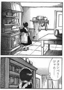
image14
Shirley (Kaoru Mori/Enterbrain) p.98

From Shirley. A little maid is preparing tea in the kitchen. Panel 2 takes place in the same room as panel 1, but her surroundings are different. So in a film, we wouldn’t see her in panel 2 at first, and after a few moments, she would enter the frame. ((In film, there are other edits possible, such as her exiting from the first panel, then already being present once the shot of the new panel starts, or her exiting the first panel, then the second scene appearing, which she proceeds to enter. However, these all have slightly different effects than the setup that I’m hypothesizing. Use your finger to cover the characters up and try for yourself.)) This girl is actually looking for cranberry jam, and so is moving from one shelf to the next in these panels. ((Pay close attention to panel 2, where the line “Cranberry jam…” appears, along with Shirley’s slightly urgent, excited posture. This is what silently helps to support the B’ edit.)) However, in manga, we can only simulate entering and exiting a frame, as these are static images. The reader must figure out what’s going on in these two panels and connect the action internally. Let’s call this B’.

B’ has a relative, which we can see here. (Shown on the screen)
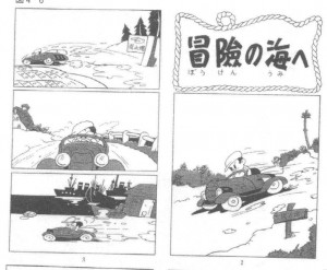
image15
Shin Takarajima (reprinted in Go Itoh,Tezuka is Dead, NTT Publishing.)

This is the beginning of Shin Takarajima, the legendary Osamu Tezuka manga that he drew at the age of 19. It seems to have been an extremely shocking manga to its young readers at the time, as they apparently felt that the car seemed to really be moving, despite the manga being static images on a page. While it’s still highly praised to this day, with individuals saying “it’s like watching a movie!” ((Though notice that there are no onomatopoeias or speech balloons.)), if you look at it carefully, this sequence of edits would be very strange if they were filmed. A car appears throughout panels 1 to 4. As I mentioned earlier, if there’s shots edited together where the action takes place in the same location with the same actors appearing in an uninterrupted way, then it would be pattern A. But as we go from panels 1 to 4, the actors are the same, but the scenery changes. Panel 1 takes place on a downhill road. Panel 2 is in a field. 3 is a road alongside the coast, and 4 is at a harbor. While the character’s action is not interrupted, the scenery is. Generally, films tend to avoid this style of editing. However, in manga, there is nothing strange about this. Consistent action–in this case, furiously driving a car at a high speed–allows the reader to overlook the disconnected flow of scenery. While this is similar to the A’ pattern, the character stays the same on the page while the background changes. If this sequence was to be filmed, I imagine that the character would have to be out of the frame at some point, meaning that it is closer to a B pattern. I’m going to classify this as a B” edit.

While Shin Takarajima is still used today as an example of “cinematic manga,” I wonder if Tezuka actually knew what makes a manga “cinematic.” Tezuka would re-draw the work entirely and publish it once more as the “complete edition” dozens of years after the first edition, and I found it was really unexciting, or not “cinematic.”
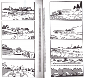
image16
Tezuka Osamu Manga Zenshuban Shin Takarajima (p.10~11)

The new version also begins with a car racing down a road, and for some reason the new edition seems overly stretched out; the revised one is set up as if a camera in a helicopter was constantly tracking the car. While a sequence like this would certainly look cool on TV or in a film, it just drags on when drawn on paper. I imagine that Tezuka, upon drawing this revised edition, thought proudly to himself, “look at how dynamic these pages are!” but I wonder why no one tried to stop him. “Tezuka-Sensei, this just looks like slow motion.” ((According to Tezuka, the panels that you see in the revised edition were ones that he wanted to draw from the beginning. If this is true, that means that his co-author on Shin Takarajima, Shichima Sakai, decided upon the original layout. So the B” edit was first invented by accident…? I wonder.))

I’ll be calling the kind of pattern seen in the revised edition of Shin Takarajima B”-(double dash minus), and I’d like to look at another example to illustrate my point.
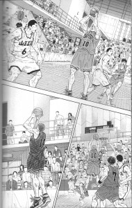
image17
Slam Dunk, Jump Comics Deluxe volume 24 (Takehiko Inoue / Shueisha) p.208

One second left in the game and Sakuragi-kun goes for a game-winning shot! We see multiple panels with the same character in the same location, but with different composition in each panel. At a glance, it might remind you of the opening sequence from the revised edition of Shin Takarajima, but in fact these three panels are drawn from entirely different perspectives while the panels from the revised Shin Takarajima are from a single perspective. In other words, it is like how multiple cameras might follow the same home run ball during the broadcast of a baseball game. I.e., this is A’. But it looks like a B”-, doesn’t it? ((In a B” sequence, the characters are the same, but the time and place between each panel are disconnected from each other. The B”- sequence is comparable to a long take in film.)) The strong point of the A’ shot is its dynamism, while for B”- it is its slow motion effect. This A’ sample is impressive for deftly blending A’ and B”- effects, creating a very dramatic scene, one 1/10th second at a time. ((I’d like to sit down and analyze Slam Dunk one day.))

Pattern C is fairly common in manga, right?
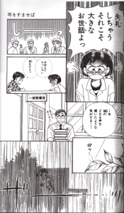
image18
Whisper of the Heart (Aoi Hiiragi / Shueisha) p.81

This is the original Whisper of the Heart. Shizuku-chan and Seiji-kun are quarreling for some reason in the library. Her father, a librarian, also appears here. After that, we see the image of falling rain, introducing a whole new scene. I’ll call this pattern C’. There are other, more subtle ways of changing scene and setting.
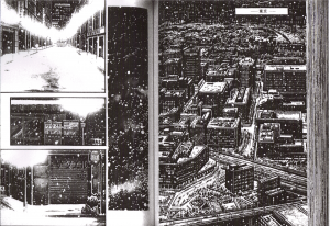
image19
SP Comics Compact Golgo 13 volume 57 (Takao Saito, Reed-sha) p.170-171

From Golgo 13. We see the streets of Tokyo via a series of panels. No one panel is directly related to the next, as their main purpose is to express the feeling of the city itself. We see this technique used in films quite a bit, don’t we? I’ll call this pattern C”.

As far as pattern D, we see this quite often in manga.
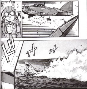
image20
Zipang 2 (Kaiji Kawaguchi/Kodansha) p.82

This is from a war manga called Zipang. It’s a SF-ish story about a state of the art Japan Self-Defense Force ship, getting sucked in by a storm and being spit out right in the middle of World War II. Here, a JSDF propeller plane is out on a scouting mission, is found by a Japanese Zero Fighter, and gets into a dogfight. Forced to counter fire, the JSDF plane shoots at the Zero in panel 1, aiming at the float attached to the bottom of the plane. Panel 2 is a closeup of the Zero’s pilot. In panel 3, the Zero makes an emergency landing in the ocean, or rather, he crashes into it. For your information, the thing you see in the left side of panel 3 is the JSDF plane’s wing. While I believe that a dozen seconds or so must take place in this sequence, we get a closeup of the pilot in panel 2, allowing the time between panels 1 and 3 to be shortened considerably in a clever way, resulting in a crisp and exciting battle scene. This definitely corresponds to pattern D in film, so I’ll call it pattern D’.

Manga are still images, drawn on pieces of paper. Even so, I bet you often think “wow, this seems just like I’m watching a movie,” don’t you? Take this, for example.
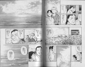
image21
Master Keaton 7 (Story: Hokusei Katsushika, Art: Naoki Urasawa/Shogakukan) p.78-79

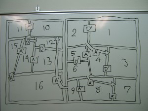
This is Master Keaton. I happened to find that a talented manga researcher singled out these two pages in one of his books, and indeed these pages are really incredibly “cinematic.” Yes, I agree that they’re cinematic. However, I’m a bit disappointed that this researcher never grappled with the question of what makes these pages “cinematic.” ((Tezuka is Dead, Go Itou, NTT Publishing. While it is an excellent work, I found it very strange that he discusses “cinematic techniques” at length but never gives a definition for this term, nor is this term found in the index.)) I then took it upon myself to analyze this page, and noticed that this page of this manga consists of nearly all A’ and D’ patterns. If we map out the panels and write out each editing pattern… (written on whiteboard)
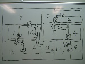
image22

See what I mean? These pages go A’, D’, C’, D’, A’, D’, D’, (new page) D’, D’, A’, A’, D, and are extremely readable. When I say that these pages are nearly all A’ and D’, it also means that there are absolutely no instances of A” patterns.

So what about the Nausicaa manga? Surprisingly enough, we find quite a few A” patterns used. Strangely, though, it never feels very noticeable. I found this one particularly impressive.
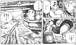
image23
Vol 5, p. 32

This is a scene where Ketcha is returning Kui’s egg. This happens to take place inside a transport glider. In panel 2, Ketcha is seen trying to loosen Kui’s saddle. A sequence of panels that has the same characters in the same spot, performing an uninterrupted action is the typical A pattern that we discussed earlier. However, if you really pay attention here, you notice that Ketcha’s actions aren’t uninterrupted. In panel 1, she is holding a giant egg, but in 2, the egg is already under Kui’s thighs. That means that the two actions, bending over and placing the egg, then standing up (The lecturer acts the scene out in front of the students) have already taken place, meaning that actions have been omitted between 1 and 2. ((However, due to the dialogue, “Oh, sorry.” “Wait, I’m taking off the saddle.” being continuous, this sequence flows naturally.))

Furthermore, in panel 3, Ketcha’s head is poking out of the window of the glider as she looks at the ground below her with Yupa. I believe that the edit from panels 2 to 3 corresponds to the film pattern B. If this were a film, we’d first see just Yupa’s head looking out the window, then Ketcha coming to poke her head out afterward. Actually, if I was adapting this manga into a film, I’d add one shot in between 2 and 3. Once Ketcha finishes unfastening the saddle in 2, the shot would change to something like this. (board drawing)
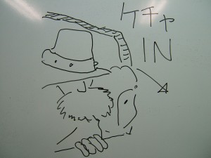
image24

Then we’d cut again to panel 3.

Why do you need to insert another shot into the sequence when you adapt it into a film, unless you see Kecha trying to poke her head in the cut equivalent to panel 3? It’s because the subject’s action has to be continuous in a broader sense even if it is actually being interrupted for a second on screen. In a film, going straight from taking off the saddle (2) to looking out the window (3) would seem far too rushed and disconnected. But, if we have her join Yupa looking down from the window, we know it’s because time has elapsed and she’s finished taking the saddle off. Since there’s no sense of continuous action from panels 2 to 3, this wouldn’t be a B pattern even when you put this sequence faithfully into film form. Again, I would probably insert the extra shot between panels 2 and 3 to make the sequence a D pattern rather than a B when adapting the work to film syntax. ((Actually, I can think of one other way of doing this, with Ketcha leaving to go to the window as Kui goes to sit back down on her egg (exiting the frame here would not be needed but is preferable). As soon as this happens, we’d cut from 2 to 3, then Ketcha enters the frame (we see her peek out from the window). The only problem here is that you’d have to animate Kui sitting and Ketcha going to the window (at the same time, at that!), which would require extra labor.))

Oh, sorry, I’m going off on a tangent about film editing, rather than manga, so I’ll try to get back on track. Assuming that this sequence is a B’, I can’t say it perfectly meets the requirement that in a B’ edit the subject’s action has to be continuous in a broader sense even if it is being interrupted for a second when a shot cuts to another. But, in fact, this sequence is quite easy to follow. If you’re wondering why, look at it more closely. Panels 1 and 2 take up the right side of the page, while panel 3 takes up the left side. This page almost reads like a map of the inside of the glider. Did you love illustrated encyclopedias when you were a kid, everyone? They often map out how each section or room is laid out inside a ship or a house in a single illustration. I think Miyazaki applied this style to the visual composition of this sequence–maybe unconsciously. We can see traces of Miyazaki’s childhood love of illustrated encyclopedias in this page.

Let’s go back and compare it to the Master Keaton we just looked at. Theoretically, we would say that Keaton, which uses no A” edits, would be more cinematic than Nausicaa. However, if we look at the two side-by-side, Nausicaa seems no less cinematic than Keaton. Why? Look closely. Many panels in Keaton extend beyond the page. We see this four times in these two pages. On the other hand, this very rarely happens in the Nausicaa pages. Incredibly, there are only two instances in the entire run of the Nausicaa manga where panels are not box-shaped. No matter how incredibly complicated and crowded the art gets, it’s always contained in rectangular panels. For a modern manga, this is a fairly rare, or should I say abstemious, spartan work.

There’s another reason that the Nausicaa manga is cinematic. During action scenes, quite a few of the edits are A’s. Take this for example.

image25
(5) p.46-47

image26

A fighter plane from the Valley of the Wind meets a Tolmekian warplane, and they get into a dogfight. Breaking down these panels, we get D’, A’, D’, A’, D’, A’, A’, A’, (next page) A’, A’, D’, D’, A’, A’, A’. Now this is incredible. A’ edits, full throttle! ((Panel 1 to 2, where the focus of the panel goes from the Valley of the Wind fighter to the Tolmekian warplane might seem like a D’, but if we consider the bullets as the focus, then this would be an A’ in substance. 3 to 4 and 5 to 6 would be similar. 11 to 12 and 12 to 13 are D’s, but if we consider the pilot as a part of the airplane, then these too would become A’s.)) The quick speed at which the reader goes through these panels matches the speed of the action. Furthermore, look at panels 11 and 12. Panel 11 is what Asbel, seen in panel 12, is seeing. Manga researchers call this technique “character-reader unification.” 11 and 13 have fundamentally the same composition, but strictly speaking the camera is behind the fighter plane in the latter panel while the former panel is drawn from the pilot’s perspective. Since the enemy plane is larger in 13 than it is in 11, we feel like the plane is quickly closing in. Also, supposing that Miyazaki redrew panels 11 and 13 both from the pilot’s perspective or from that of the imaginary camera following the plane in a high speed dive, skipping panel 12, this sequence would still work fine, but it would certainly lose its exciting dynamism since it turns into a B”-, or into slow motion. By inserting Asbel’s face between panels 11 and 13, and also changing the camera perspective, Miyazaki escapes creating a drawn-out scene that B”- sequences tend to create.

Let me bring out another example. This one’s from Zipang:
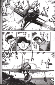
image27
Zipang 2 (Kaiji Kawaguchi/Kodansha) p.60

A Zero fighter begins firing on a JSDF plane. If we break down the panels, we get D’, D’, A’, D’. Kawaguchi’s manga, such as Zipang and The Silent Service, are often praised as “cinematic.” However, we see surprisingly few A’ edits here. The reason behind this comes from the time schedule that this work is produced on. Nausicaa wasn’t serialized in a manga magazine, but rather an anime news and information magazine. That meant that the manga could be produced very slowly, around only 16 pages a month. Compared to that, Zipang was serialized in the weekly magazine Morning, which would call for 18 pages a week. Of course, this kind of volume can’t be produced by one person alone, and so Kawaguchi-sensei has 6 to 7 assistants in his studio, all working together to produce the manga. The basic sketches of the panel layout and composition, what Japanese manga artists normally call “Name”s, are created by Kawaguchi, who would also draw the main characters such as the pilots. However, things like the Zero and the JSDF plane, or the spray of the waves of the ocean would be handled by his capable assistants, using photos as reference. To make a grossly simplified classification, there are two kinds of panels here: ones that Kawaguchi penned himself, and ones that were only laid out by him that the assistants would work on, both of which would appear normally next to each other in the manga. Naturally, there will be more D’ edits.

So, in both Nausicaa and Zipang, we see panels of a pilot’s face inserted in the dogfight scene. But in the Nausicaa example, doesn’t it feel like the pilot is actually a part of the plane, or rather, that the plane is an extension of the pilot? While we are shown the faces of a given plane’s pilot, whether that is Asbel or Mito or a Tolmekian soldier, it ultimately feels like we’re watching two birds engaged in aerial combat. In Zipang‘s case, the JSDF plane and the Zero both seem like plain machines, and it feels more like the pilots are the main characters of the scene.

However, the techniques that these two have in common are their use of on’yu (sound effect, or “sonopher”) and keiyu (visual effect, or “formpher”). The “DAKAKAKA (ダカカカ)” and the “VUII (ヴイイ)” you see in the top and bottom panels are on’yu. We also see some strange, thin lines surrounding the plane. These express that the plane is flying at a high speed, and we call these keiyu. On’yu and keiyu are a vital part of what makes comics, especially Japanese manga, so dynamic. However, you have to be careful not to overuse them, or else they get in the way of the story.

Let me show you an example of these techniques used in an unintrusive way.
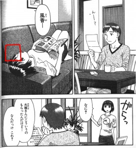
image28
Yotsuba&! 1 (Kiyohiko Azuma/Media Works p.118)

image29

From Yotsuba&!. These are succinct and unintrusive. Nonetheless, on’yu and keiyu are being used in a very subtle way. As an experiment, let’s erase the keiyu next to Fuuka-chan’s head and the “Gara (がらっ)” on’yu in panel 3.

image30

image31

In the original panel 2, Fuuka-chan is bending her head back when she hears her mother calling, but if we erase the keiyu in the panel, it looks as though she was in that position even before her mother called her. Thus, the relationship between panels 1 and 2 become fuzzier without the keiyu.

Next, panel 3. Here, Fuuka-chan opens the door, “Gara,” and says “what?”, but if we take the “Gara” out, it seems like the door was open before she entered the room, see? To put it a different way, just by using the on’yu “Gara,” the action of “Fuuka opening the door” is expressed–the reader fills in the blank, mentally. While Yotsuba&! seems like a relatively simply drawn manga, it still uses on’yu and keiyu, in subtle ways. In some ways, you could consider this as a very restrained manga. Although, a surprising amount of work went into Fuuka-chan’s chest in panel 2. ((Say that the magazine wasn’t slightly being held slightly above her stomach in panel 2. If that were the case, there’d be no shadow on her stomach, which would mean that her breasts were less emphasized than they are here. I’d also like you to notice that the edge of the spine is close to touching her nipple.)) Azuma-sensei, you perv (lots of laughter).

JAniCA Club Blog Translation: What’s Going On in the Anime Industry Right Now?!

Thursday, October 1st, 2009

Blogger’s/Translator’s introduction: A number of weeks ago, I was trawling through my usual Google Reader feeds when I noticed a good number of Japanese sites linking to one of the blogs on the “JAniCA Club” side of the JAniCA (Japan Animation Creators Association) website. The blog, written by anime director Osamu Yamasaki, details the current situation in the anime industry, especially from the perspective of the animators themselves. I found Yamasaki-san’s blog very interesting, and received permission to translate a particularly insightful entry. During this whole process, ANN has posted an article drawing from the same posts, so this may be material you’ve seen before. However, I think that Yamasaki’s presentation of this information is an informative one, and that his original words, though translated, may provide a better picture of things that may have been harder to deduce from the non-editorial style of the ANN post. Of course, I’d like to thank Yamasaki-san and Nekomiya-san, along with everyone else at JAniCA involved in allowing me to post this translation, and I hope to be able to translate and post other articles from the blog in the future.

– – – – – – – – –

What’s going on in the anime industry right now?!

I think that it’s a wonderful thing that the Animator’s Field Survey Symposium 2009 was conducted and held without a hitch.

It seems like the findings were quite a shock to the general public of Japan who watched that day’s NHK late night News, along with foreign anime fans…

However, you really cannot understand all of what is going on in the anime industry just based off of the information in the Symposium.

That’s why I’d like to use this post to set the record straight and clearly explain about the current state of the anime industry.

First off, it’s easy to see that the anime industry as a whole is not a poor one, as clearly seen by the large amount of content it is producing to a global audience, on the level of tens of trillions of yen.

So then why are the animators on these works as poor as they are?

Naturally, there is a reason behind this.

What you hear quite often is “It’s because the ad agencies and the TV channels take such big kickbacks…” and this certainly may be a large problem.

However, I’m not in a position to fully understand what goes on in that realm, and so I’ll avoid talking about that subject as if I knew what really goes on there.

There are rumors about the Japan Fair Trade Commission coming in to expose and clean up this section of the industry in the not-too-distant future, and so I’d like to watch what happens with that in time to come.

Now, let’s go back and take a look at the state of things on the production side of the situation.

First, there’s the widely-discussed issue of the current state of things for inexperienced inbetweeners

As explained in the Symposium, ever since the switch to digital animation, an inbetweener produces 500 drawings on average in one month.
The inbetweener is paid 200-250 yen per drawing, and so their monthly income is 100,000 to 120,000 yen, which after 10% tax turns into 90,000 to 100,000 yen take-home pay.
From this monthly income, they have to pay for their national pension, healthcare, rent, and food.
When you consider that rent in Tokyo is 50,000-70,000 yen, it is clear that one could not possibly live a decent life on this rent.

Compared to this, how much does a similarly inexperienced anime painter (shiage, coloring + touch-up animation) make?
One painter finishes 2000 drawings on average in one month.
The painter is paid 180-200 yen per drawing, and so their monthly income is 360,000 to 400,000 yen, which after 10% tax turns into 320,000 to 360,000 take-home pay.

Why does this difference in pay exist?

It’s because the relative prices paid per drawing that was established during the pre-digital era of anime exists unchanged to the current day.

In the past, a cel painter would have to wait for paint to dry, trace shadows with color, and so on, requiring the same proficiency of technique, as well as time and effort, that an inbetweener needed to have, and they would complete around 700 to 1000 drawings a month.

During this period, inbetweeners would complete about an equal number of drawings.

This is why you’ll hear veteran animators who worked as inbetweeners twenty years ago often saying, “In my day, everyone was doing 1000 drawings a month,” without really understanding the current situation.
In those days, due to the nature of the trace machine ((a machine that would bake carbon lines onto cels)), lines from anything other than graphite pencils, such as lines from color pencils, would not be transferred onto the final cel. This would allow for “one-shot drawings” where one could draw a draft on a sheet in color pencil, then trace it on the same sheet of paper for their final drawing. Also, even if the pencil lines in an animator’s final drawings were not perfectly connected, cels were hand-painted, so one didn’t have to worry about colors extending past their pencil lines as a result of a color fill tool being used on an unconnected area as they do now.

Comparing the current methods of digital paint, where one doesn’t even have to color shadows on the reverse side of the cel anymore, the amount of time and labor spent by a painter compared to an inbetweener has decreased drastically.
The reason new animators live in such distressed conditions is because the relative prices of these two jobs has not been changed, because of individuals who do not understand the changes that have occurred in these two occupations.

This issue is also resulting in the creation of a problem that can result in the breakdown of production schedules.

What is becoming of the anime industry, where the conditions above have already been going on for the past ten years?

The number of talented young individuals in the current anime industry who can draw decent key animation has shrunk by a extremely large number.
The harsh working conditions that new animators face is the primary cause of this problem.
Many anime companies ask new animators when they hire them, “can you commute from home?” or “are you receiving an allowance from your parents?”
This is because newly hired animators will not be able to sustain themselves without these things.

With this initial filtering of their applicants, the companies repel a large number of talented individuals who want to work in the anime industry, leaving only those who will work for 50,000 to 60,000 yen a month.
While a few young men and women with skill and craft remain within this group, willing to work, a significant amount of the rest of the group are hobbyists.
People who don’t particularly care if anime is their job.
A large number of staff who treat drawing anime as a hobby enter the industry every year.

In the past, most animators quit because they didn’t have the talent for it.

But these days, smart and talented individuals are leaving the industry.
Of course, this can’t be said about everyone in the industry.
I do have juniors in the industry, leading difficult lives where they are trying desperately to pursue animation as a profession.
However, working right next to these serious and dedicated individuals are hobbyists who lazily draw pictures as if they were doing it for fun, people who are making doujinshi, or who are playing games, watching anime, or reading manga instead of doing work.
If they can earn their monthly allowance of 20,000 to 30,000 yen, they’re happy to continue on with their carefree lives.

Smart and motivated newcomers who see that leave the industry.

They see their friends in college who were less talented than them go to work in the gaming industry where they make around 300,000 yen a month, and think that it’s just stupid to be crushed by the absurd industry that they’re currently working for.

The result of this is that the talent pool of animators is running dry.

This has been going on for ten years.
The percentage of talented key animators rising up from this pool of fresh animators has fallen drastically.
Currently, the exemplary directors, animation directors, designers, and talented key animators who are all holding up the Japanese animation industry are in their 40s and their 50s.
Most of these individuals were already working as directors, animation directors, and designers when they were in their 20s.

This same group is still supporting the anime industry today.
And as the years continue to go by, the weight on these men’s shoulders is only increasing.
It’s because there has been a shocking decrease in the number of talented key animators who ought to be fostered by the system.
Young animators today can’t draw layouts.
They can’t draw key animation or proper timing (exposure) sheets.
So, if the director or animation director doesn’t go back and fix everything, then it won’t pass as a decent work of animation.
With no other options available to them, the veterans will draw all of the key animation, while the young animators will just do cleanup.
This is called “2nd key animation” and people in this position may think of themselves as key animators, but twenty years ago, this was called key animation tracing, which was a job of the inbetween animator.

These days, you often hear complaints like, “The director or animation director is getting too involved in production and not doing their checking duties on time, which means we’re rushed on our schedule, and it’s causing us a lot of trouble” coming from colorists, photographers, or sound engineers.
However, if the animation isn’t redrawn at this step, the end product will look horrible.
The person who the abusive cries of “terrible, off-model animation!” ((作画崩壊!, Sakuga houkai!, a commonly hurled complaint)) and “awful production!” are directed at? The director or the animation director.

This is also where a client passes their assessment.

If a poor end product is created, the director and the animation director will have a harder time finding their next job.
However, decent key animators aren’t being brought up.
With no other option, directors and animation directors shave off more hours from their nightly sleep and fix more drawings.

Animation directors earn 300,000 yen an episode.
On average, it takes a month and a half from the time that drawings are received to the time that the episode is finished.
This means a monthly salary of 200,000 yen.
These directors are twenty-year veterans of the anime industry.

Working in the same place as these directors are inexperienced colorists, making 300,000 to 400,000 yen a month.

The producers at the production companies understand the state of things, but they do nothing to change them.
It’s because this problem can’t be fixed by just one company adjusting their pay rates.

An absolute minimum living wage for a fresh inbetweener is 150,000 yen.
Dividing this by 500 drawings a month, that comes out to a minimum of 300 yen a drawing.

Currently, the cost of a colored inbetween frame between colorist and animator is 400-450 yen.

If you give 300 yen of this to the animator and the remaining 100 to the colorist, do you know how much the colorist would make?
2000 drawings a month times 100 yen = 200,000 yen.

Why can’t companies fix their budget like this?

We strongly wish that the Association of Japanese Animators, the regulatory body organized of the various production companies, will take the needed measures and enact regulations.

Spreadsheet Compilation of Various Japanese Popularity Metrics for Summer 2009 Anime

Wednesday, September 30th, 2009

At school, not wanting to drive home in my long break between meeting my advisor and a film screening cause of rush hour. Therefore, this hastily-done silly translation of a spreadsheet some 2cher made of various popularity rankings for summer season anime. Any questions should be answered by the notes, but if not, just post a comment! Click for large, obviously. Oh, and Stolen from Yunakiti, just like all the cool guys do.

2chtl

Toshio Suzuki and Mamoru Oshii Conversation Fan Translation: Suzuki Toshio no Ghibli Asemamire – Episode 45: Ponyo vs The Sky Crawlers

Saturday, July 11th, 2009

Last year, I was sitting in a lecture hall in Kyoto Seika university, I believe at a guest lecture Takekuma Kentaro was giving, when the speaker mentioned a radio show that featured anime director Mamoru Oshii grilling Ghibli producer Suzuki Toshio on Ponyo. I forgot about it for a bit, until all the buzz about the US release of Ponyo started heating up. I soon discovered that the radio show this conversation took place on, Suzuki Toshio no Ghibli Asemamire was available for free online! The episode in question is the August 2008 broadcast, “Ponyo on the Cliff by the Sea vs The Sky Crawlers.’ An mp3 was available for download on the site from here (next to 2008/8/12), and I also discovered a unofficial transcript of the conversation on this blog, so I used these resources to create an unauthorized fan translation of this radio show. If you can, I suggest listening to the radio show alongside the transcript in order to hear more of the emotion in their voices, but that is obviously optional. A dvd of over 40 hours of the radio show is also available for purchase.

The often-heated but always-friendly conversation touches a number of subjects, from Ponyo and The Sky Crawlers, to the state of the Japanese animation industry and the fate of hand-drawn animation. I hope you find it as interesting as I found it, and as usual, please don’t hesitate to contact me through comments or email with any corrections, suggestions, or questions. Also, if you are a rights holder of any of the materials that I have translated and would like the material taken down, again, please contact me through the email address found on the sidebar.

Suzuki: Have you seen [the new] Indiana Jones?
Oshii: No.
S: You should see it. Basically, it’s present-day Harrison Ford playing Indiana Jones, and about his grown-up son that he had when he was messing around with women in the past, right? So, I was wondering, why is it that everyone’s making movies these days about parents and children? Look, Miya-san is doing it, you’re doing it… If I wanted to sound like a critic, I’d look at you three and say that what’s interesting is that your movies are in the sky and in the ocean… They’re in unexplored territory.
O: That’s right.
S: So then, what’s here and now doesn’t matter to you. That’s what I found interesting. Don’t you think?
O: That’s standard, patented Suzuki Toshio sophistry of the highest order.
All: (Bursts out laughing)
O: Tell me what you personally found interesting, okay?
S: I was just thinking. It was a thought.
O: A thought? Isn’t it obvious that someone getting older is going to make stories about parents and children?
S: Yes, that’s exactly it! Miya-san is 67, right? And Spielberg is 62, 63?
O: Around 63.
S: Right? And Oshii-san, you’re 58?
O: 57!
(laughter)
Staff: So that one gets a rise out of him! (laughter)
S: So, all of you are working with the same theme, you see? The details between each film might be different, of course. But still, it surprised me. And what I was thinking was, whether your stories are in the sky, or in the ocean, or in uncharted lands, they’re all the same thing. They’re all about the afterlife.
O: Well, that’s inevitable.
S: Huh?
O: If you’re older than 50 and making movies that don’t deal with the afterlife in some way, something’s off about you.
S: Yes, yes, yes. (Impressed)
O: I saw Ponyo the other day and figured something out. I realized, “Oh, Suzuki Toshio had absolutely nothing to do with this movie,” and I was certain about it.
Staff: Absolutely nothing? (strained laughter)
O: That was a 100 percent Miya-san movie.
S: Well, it really is Miya-san’s movie.
(more…)

Garo 1964 Title/Author Listing + Notes

Wednesday, May 20th, 2009

Last semester, I took advantage of the fact that a local library had the full run of the legendary underground manga magazine Garo and wrote a little paper on it. I’m not going to torture you with the paper here, but in the process of writing the paper, I found that there really was less than I had imagined about Garo. In order to remedy that in at least some small way, I figured I’d do a little romanized listing of the contents of Garo issues, mostly taken straight from the Monthly Manga Garo Index hosted on the Nagai Katsuichi Manga Museum‘s home page (Nagai Katsuichi was the first EIC of the magazine). A big thanks to Shiraishi-san, who maintains the website, for allowing me to basically copy the index wholesale into English. I’ll also be adding little notes here and there after the listing of each issue until 12/1970, if I have any jotted down in my notebook. I may also stop after 1970, since that’s where my experience with the magazine ends. Any comments or corrections are always greatly appreciated.
Also, I’m sorry that I’m terribly inconsistent about this on my blog, but names will be in the format of Lastname Firstname, and individual stories in each issue will be listed as Author, “Story”.

——-

September 1964 (First Issue)
Front Cover: Shirato Sanpei
Shirato Sanpei, “Zashikiwarashi”
Shirato Sanpei, “Akai Take”
Shirato Sanpei, “Younin”
Shirato Sanpei, “Kugutsu”
Mizuki Shigeru, “Furou Fushi no Jutsu”
Suwa Sakae, “Unabara no Ken”
Uchiyama Kenji, “Doubutsu Hyaku-Wa”
Ri Haruko, “Douwa, mo Kichi”
Sato Tadao, “Shirato Sanpei-san no Manga”
Kagemaru, “Dakyou Haisu Kokou no Shisouka”

Notes: Suwa Sakae was apparently a pen name for Kojima Goseki, who was then assisting Shirato Sanpei.
Despite being started in order to run Shirato’s Kamui-den, it does not begin running until the fourth issue, and the first three issues instead run collections of Shirato’s earlier short works. “Shirato Sanpei-san no Manga” is located behind the front cover of the magazine, and is an essay by a prominent film critic on the depth and complexity in Shirato’s works. Most, possibly all of the other manga in the issue is also manga about ninjas.

October 1964
Front Cover: Shirato Sanpei
Shirato Sanpei, “Kugutsugaeshi”
Shirato Sanpei, “Mumei”
Shirato Sanpei, “Musashi”
Suwa Sakae, “Unabara no Ken”
Mizuki Shigeru, “Ibo”
Kusunoki Shouhei, “Senmaru”
Uchiyama Kenji, “Doubutsu Hyaku-Wa”
Kagemaru, “Dakyou Haisu Kokou no Shisouka”

Notes: I believe that Sato’s introduction runs once again on the inside of the front cover for this issue. A reader’s corner where submitted letters are printed starts in this issue. Kusunoki Shouhei’s Garo debut. The magazine adopts the subtitle “Junior Magazine” in this issue.

November 1964
Front Cover: Shirato Sanpei
Shirato Sanpei, “Sugaru no Shi”
Shirato Sanpei, “Oni”
Shirato Sanpei, “Myoukatsu”
Shirato Sanpei, “Maboroshi no Inu”
Mizuki Shigeru, “Kunshou”
Suwa Sakae, “Unabara no Ken”
Kusunoki Shouhei, “Senmaru”
Uchiyama Kenji, “Doubutsu Hyaku-Wa”
Doya Ippei, “Jujitsu Kouryuu Hiwa: Tamasudare”
Mura Shigeru, “Manga no Kakikata”
Sanpei Shirato, “Jigou yori Hajimeru Sakuhin ni Tsuite”

I believe that the last title on this list is the back of the front cover of the magazine. In this article, Sanpei talks a little about his new work that will be starting in the next issue, “Kamui-den.” Mura Shigeru is Mizuki Shigeru’s birth name.

December 1964
Front cover: Shirato Sanpei
Shirato Sanpei, “Kamui-den”
Suwa Sakae, “Unabara no Ken”
Mizuki Shigeru, “Nekomaru”
Kusunoki Shouhei, “Senmaru”
Mura Shigeru, “Manga no Kakikata”
Kouyama Hideo, “Nega no Miryoku”
Fujikawa Chisui, “Shirato Manga no Omoshirosa”

Notes: Kamui-den‘s debut issue. Most issues of the manga are around 100 pages, and since the magazine is around 135 pages at this time, it takes up a very significant chunk of the magazine’s pages.

Japanese Lecture/Blog Post Translation: The Space Between Anime and Manga: #5: Katsuhiro Otomo, the Anti-“Story” Author by Kentaro Takekuma

Sunday, May 17th, 2009

Quick translator’s/blogger’s introduction, hopefully shorter than the one to the previous translation of the outline for the lecture given before this one, Why is the Manga Version of Nausicaa So Hard to Read by Kentaro Takekuma, best known in America for Even a Monkey can Draw Manga This lecture was originally given at Kyoto Seika University on 2008/12/18, and the blog post of these outlines can be found here and here.

Formatting for this one will probably be a little sloppier since this won’t be used as a translation/writing sample for school, but I’ll do my best to stay consistent with (Firstname) (Lastname) with names, no capitals this time. I don’t really have much else to add to this, other than that hearing this lecture got me to go down to Mandarake and buy up a bunch of Otomo’s short story collections, which were all engrossing.

———-

The Space Between Anime and Manga
Outline for the lecture series given at Kyoto Seika University
#5: Katsuhiro Otomo, the Anti-“Story” Author
Lecturer: Kentaro Takekuma

The State of Manga During the 70s and 80s

Katsuhiro Otomo debuted as an author in the early 1970s. I’d like to begin by trying to give some structure to the state of manga from his debut in the early 1970s to the early 1980s. The manga world during this time was going through an incredible period of change, which we may never see the likes of again. To try to sum it up briefly:

*Gekiga enjoys its period of full maturity thanks to the rise of Seinen magazines (Big Comic, Manga Action, Young Comic, etc)

*Circulation of Shonen Sunday and Shonen Magazine drops severely, due to the oil price shock, seinen magazines attracting their older readers, and emerging shonen magazines such as Shonen Champion, Shonen Jump and others taking their younger readers.
– The next generation of manga magazines begins at this time.

*The shoujo manga boom begins, attracting male readers alongside female.
– Central to this boom were the female authors in the “Year 24 Group” such as Keiko Takemiya-sensei.

*The first Comic Market is held in 1975.

*Magazines targeting a hardcore audience, such as Manga Shonen and Manga Kisoutengai begin to be launched one after the other, starting around 1977. (The anime boom starts during this period, as well.)

These trends in the manga world, from gekiga to shoujo manga, as well as the creation of fan-targeted magazines, which Comiket and the anime boom both tied into, all combined to form a base for the manga and otaku culture we have today.

Katsuhiro Otomo’s Traits as an Illustrator

As he didn’t attract much attention until relatively late in his career, it is often mistakenly thought that Otomo didn’t begin drawing until the end of the 1970s, but in fact, Otomo debuted in 1973. He began submitting works to Shonen Sunday and COM in the early 1970s, and his real debut work was “Juusei” (“Gunshot”), published in the August 1973 issue of Weekly Manga Action Zoukan. In the following years, he published more short works at a leisurely pace, and began to attract attention from other professional manga artists as well as manga fanatics in the mid-1970s.

The reason Otomo didn’t attract much attention at first was a combination of his extremely low output and a popular conception that his stories and art were plain. Of course, even these earliest works are of unusually high quality, clearly displaying his talent while deviating from the trends of mainstream manga of the time. However, Otomo’s scripts during this period very intentionally avoid and reject climaxes, which would understandably cause his works to be buried under the passionate, intense manga that was prevalent during the period.

We can view these early Otomo works, with their subdued art and scripts, as the antithesis to gekiga, which was at the height of its popularity during this time. Though gekiga can be seen as the antithesis to Tezuka-style manga itself, as it attempts to introduce a new level of realism to manga, Otomo’s manga does not attempt to return to a Tezuka-like style. Instead, it inherits the tradition of realistic art that the gekiga movement started, while boldly rejecting the expressionistic techniques that gekiga developed (panel frames extending beyond the page, super-dense motion lines, manga symbols (tl note: manpu, basically the sweatdrops and forehead veins we all know and love), standardized poses during action scenes, and so on).

I imagine that Otomo must have considered the realism of these techniques and concluded that they weren’t realistic at all. By removing all the conventions that readers had come to expect in manga, Otomo achieves his own level of realism, creating a feeling similar to that of, say, the one felt when watching Takeshi Kitano’s early films.

This aim towards realism extends to a large number of Otomo’s early works where he intentionally does not draw “money shots.” Such flashy scenes must have been thought of as unrealistic to him. Looking back on his work from a present-day standpoint, though, it’s shocking to now see how Otomo’s doctrinally anticlimactic output perfectly captured the mood of the 1970s.

If we look at the 60s as a period of politics and rebellion, as symbolized by the student movement, then the 1970s were a period of societal lethargy, born from the stall in the student movement and the end of the post-war economic miracle. Many young men and women during this period not only felt directionless, but had to worry about even having a roof over their heads from day to day. Whether it was Marxism, Free Love, or Indian spiritualism, young peoples’ values seemed to become more self-centered and introverted.

Finding himself in the center of this group, Otomo realistically drew the daily idleness of the lives of high school and college students. While on occasion he dealt with extraordinary themes like violence and rape, he drew these without traditionally-used “money shots” or a general eye towards making his manga as stylish as possible, but rather depicted these events from an extremely objective viewpoint. For example, when someone gets shot in Otomo’s manga, we don’t see the shooter in a generic pose, a closeup of the gun’s barrel, or the moment that the bullet is in flight. Instead, Otomo draws our attention to a man-shaped thing falling to the ground. Instead of drawing a cool, set pose after one person shoots another, Otomo prefers showing the uncertainty and shamefulness of the act, and it is this sort of realism that caused Otomo to go unnoticed and unacclaimed for so long.

Otomo began using a mapping pen fairly early in his career. In gekiga works of the time, characters were drawn with the dynamic lines of a G-pen, and the mapping pen was used in a supplementary fashion, drawing scenery and action lines. However, Otomo drew everything in the thin, lean lines of a mapping pen, giving equal weight to both character and scenery. While this is the source of the sense of objectivity seen in Otomo’s manga, this technique was an unthinkable one in the world of gekiga until this point, as drawing in this manner would normally just elicit the reaction that “the characters don’t stand out.”

While Otomo used a lot of filled inking in his earliest works, the darkness of his earlier works begins to fade as time goes on, and he begins to use large areas of white space in both character and setting shots. Again, his panel layout was very orthodox, avoiding overly formal techniques such as extending panel frames to beyond the page, and he used very few manpu. We could say that the defining characteristic of Otomo’s work during this period is that it was “anti-manga style,” and was instead similar to the real-life image.

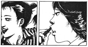
otomo1It’s been said that Otomo’s 1970s manga were the first time that a Japanese person was drawn with an Asian face in manga. (“Okasu”, 1976)

One could say that another one of Otomo’s “inventions” was his way of depicting Japanese characters with Asian facial characteristics, such as almond-shaped eyes and a low nose. For example, in Takao Saito’s manga, a character like Golgo may be Asian according to the story, but looks nothing like an Asian man. Again, Otomo’s blunt objectivity brought about a new kind of realism to an aspect of manga that had previously been dominated by manga’s “lie” of characters depicted in a borderless way. This too is a kind of realism that could only have been established in the 70s.

The “Anti-Story” Seen in “NOTHING WILL BE AS IT WAS”

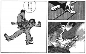
I’d like to present Otomo’s 1977 “NOTHING WILL BE AS IT WAS” as good example of a work that exhibits the defining characteristics of 70’s Otomo. This work is about a man who, after unthinkingly killing his friend during an argument in his room, is faced with the problem of disposing of his friend’s corpse, followed by his eventual dismembering and “disposal” of the body.

This work completely does without aspects of a murder case that a criminal drama would depict, such as the killer’s motive or methods. In the very first panel of the story, we see a closeup of a dead body lying on the floor of an apartment room, and from there all we see is the main character’s disposal of his friend’s corpse in a detailed but disinterested way. In the end, we don’t even see the consequences of the crime. The only thing we do see is the main character’s neighbors thinking that he’s acting suspicious, but not a single thing about the discovery of the crime or the character’s arrest.

otomo2“NOTHING WILL BE AS IT WAS”, from 1977. Unable to cut through fat, the main character has to keep heating his hand saw in order to dismember his friend. This seems so real you might begin to wonder if the author has had experience killing a man himself.

In other words, this work is like a simulation of what a person would do if they had inadvertently killed a person in their apartment. Otomo simply wanted to depict the difficulty in dismembering a corpse in one’s own apartment, and ethical themes such as how the murder came to happen, the protagonist’s feelings of guilt, or the main character’s fate after his crime is discovered are completely absent. The author simply does not seem interested in “typical stories” like that.

We can also see Otomo’s “anti-story tendencies” in the irregularities of the story in works such as his 1976 “Okasu” or the 1977 “Uchuu Patrol Shigema”. While the plots of these works would normally not be enough to base a manga on, Otomo’s artistic and directorial skills, based upon his thorough devotion to realism, make these works possible.

Otomo in the 1970s was able to use his exceptional artistic talent to demolish the idea of the “story”. By bringing his story down to the same level as his art, any sort of moral messages could be excluded. This could be called the defining element of the early Otomo’s style of realism.

Turning the “background” into the main character

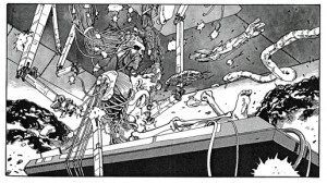
otomo3The incredibly famous scene from “Fire Ball” (1979), where the main character, reduced to bones and organs, rises from the operating table. This one nightmarish panel fixed the path for all of Otomo’s later works.

Katsuhiro Otomo first gained public attention after the publication of his 1979 “Fire Ball.” This is the work where Otomo’s sci-fi side, which could only be seen in small glimpses in his previous short works, came into maturity. It was also the prototype for his later work AKIRA. The protagonists of the story are a pair of brothers living in a future world controlled by a computer. While each were living their own separate lives, the older brother a policeman and the younger brother an anti-establishment activist, the giant, society-domineering computer discovers that the older brother has psychic talents, and vivisects him for research purposes. Meanwhile, the younger brother attempts to destroy the computer, but is discovered shortly before he is able to, and is shot to death. At that moment, he telepathically calls out to his older brother, who is then being analyzed by the computer, causing his psychic abilities to manifest themselves. He rises off of the table, his body nothing but bones and organs, and begins to use his terrifyingly incredible powers to destroy the city.

The surreal image of the older brother rising from the operating table was sensual and overwhelming, and coupled with his outstanding art, was the topic of much discussion at the time. This work also marks the moment that Otomo, who had previously intentionally avoided climaxes, created a work with a flashy climax, and the mix of objectivity and visual flashiness that Otomo realized in this work was perfected in his later works such as Kibun wa Mou Sensou (written by Yahagi Toshihiko) and Domu.

While the plot of “Domu”, a work where a senile man and young girl have a psychic battle set in an enormous apartment complex, is certainly a unique one, Otomo’s successful depiction of the innate strange eeriness of the work’s urban setting is what elevates it to a masterpiece of modern horror. The inorganic way in which each individual within the apartments is implanted inside it is perfectly matched to Otomo’s objective style, and it could even be said that the real main character of this work is the apartment complex itself. Otomo’s manga gives its characters and its backgrounds equal prominence, and with Domu he successfully created an exceptionally unique work within manga where background (the scenery) is given the lead role. This style comes into full bloom in his later work AKIRA.

AKIRA, which began serialization in Young Magazine in 1982, along with its anime adaptation, brought worldwide fame to Otomo.

Katsuhiro Otomo, the Filmmaker

Looking at Otomo’s work through the lens of manga history, his works could be seen as ones which exemplify one style of “film-like manga”. (it could also be said that while his literary style differs from Tezuka’s, Otomo’s made a return to Tezuka’s cinematic style in other ways) His extreme attention to the “objectivity” of his drawings led to the restrained uniformity of the thickness of his pen strokes and the exclusion of mangaesque techniques such as manpu wherever possible. However, he ultimately expresses and treats time in paper 2d media in a very manga-like way.

You can get a good idea of Otomo’s orientation towards live action film in a manga such as “San Bergs Hill no Omoide”. In the work’s climactic shootout, you may be reminded of the action direction of one of Otomo’s favorite directors, Sam Peckinpah. Peckinpah’s frequent usage of many quick cuts, as well as slow motion during important scenes, can be seen beautifully expressed in Otomo’s onomatopoeia-free pages full of many small panels. Of course, while this technique is cinematic in a way, it is at the same time something that could only be expressed through manga. If you get a chance, compare this work to Peckinpah’s masterpiece The Wild Bunch. I think you’ll find it very interesting.

Eventually, the cinematically-inclined Otomo was naturally steered towards creating films himself. As a long-time movie fan, Otomo had made self-produced films since his school years, and had been still creating films such as Jiyuu wo Warera Ni while working as a manga-ka. What finally got him into animation was his being hired as the character designer for Rin Taro’s 1983 Harmageddon, produced by Kadokawa Pictures.

Otomo’s work on this movie stretched far beyond his given position of character designer, as he became a major contributor to many sides of the film’s production, submitting setting concept art and imageboards. He was also able to meet many talented staff while working on the film, and thus the door to becoming an anime creator was opened to him. Otomo’s maiden work was “The Order to Stop Construction” (written by Taku Mayumura, 1987), one part of Kadokawa’s omnibus Neo-Tokyo. This work is so incredibly well made that it’s shocking to think that it’s Otomo’s directorial debut. Otomo’s visual technique of the “background as main character” in this work slowly corroding the characters of the anime is perfected in his feature-length AKIRA, a film that stunned both live-action and animation filmmakers around the world.

Otomo has distanced himself from manga in recent years, and has been working primarily as a filmmaker since the late 80s, and while he’s made many exceptional films, I doubt that I’m the only one out there who hopes that Otomo will once again return to making manga.

Japanese Lecture/Blog Post Translation: The Space Between Anime and Manga: #4: Why is the Manga Version of Nausicaa So Hard to Read? by Takekuma Kentaro

Monday, April 13th, 2009

Translator/blogger’s Introduction: This is another post in what will hopefully be a more regular series of translations of articles by Japanese bloggers and thinkers on manga, anime, and all of those sorts of visual culture that we enjoy so much. There’s a huge amount of interesting material available out there that’s quite unfortunately out of reach to a large part of non-Japanese fandom, and I hope that these posts help out in building the bridge between the English and Japanese-speaking ‘spheres. I was delighted to see a positive response to my first translation, a post by Tamagomago-san on the 3rd opening of Goku Zetsubou Sensei, and would like to thank everyone who commented on the errors in my translation. Again, if you notice any errors in my translation or if you have any comments/questions on this post, I appreciate every single one.

On to the article. This post is a translation of a post by Takekuma Kentaro (probably best known in the states for co-authoring Even a Monkey can Draw Manga) on his blog Takekuma Memo. This post (split in two parts, part 1 and part 2) was taken from the detailed handout given at one of his series of lectures at Kyoto Seika University with the collective title “The Space Between Anime and Manga,” and the subtitle of this specific lecture was “Why is the Manga Version of ‘Nausicaa’ So Hard to Read?” I was lucky enough to be able to attend this lecture, as well as the final two lectures in the series, which I hope to translate in the near future. I was also fortunate enough to obtain permission from Takekuma-sensei to translate his post, an allowance I am very grateful for. Some notes about formatting: I’ve tried to preserve the original formatting in a form that wouldn’t result in mojibake the average person’s browser, so I’ve gone with *s for circles and indents for arrows, both markers of the flow of the lecture in the original handout. Also, please keep in mind that this is a translation of a handout, and thus may require some level of independent thought in order to figure out what the author is getting at. Once again, I appreciate any and all comments, so please feel free. Happy reading!

– – – – – – – – – –

The Space Between Anime and Manga
Outline for the lecture series given at Kyoto Seika University
#4: Why is the Manga Version of Nausicaa So Hard to Read?
Lecturer: Kentaro TAKEKUMA

[A] The Complex Relationship Between Osamu TEZUKA and Hayao MIYAZAKI.

* Many publications ran memorial features on Osamu TEZUKA upon his death in 1989, and while most experts and insiders would memorialize him in these articles, Hayao MIYAZAKI, while acknowledging Tezuka’s achievements as a manga author, criticized him harshly with regards to his activities within the field of animation, leaving many around the world dumbfounded.

     â€œBut as far as animation—I say this believing that on this topic alone I have the right, and also some duty to say this—Everything that Tezuka-san had spoken about or advocated was wrong.” (“Tezuka Osamu ni ‘Kami no Te’ wo Mita Toki, Boku wa Kare to Ketsubetsu shita ”. Miyazaki, Hayao. Comicbox, May 1989)

     Miyazaki sharply criticized Tezuka by saying that he believed that as an animator, Tezuka was a “Novice” and an “Unskilled Enthusiast”, but that despite this he was able to use his fame as a manga author to create his own anime company which then began to produce television anime, severely warping the direction of the Japanese animation industry.

     On the other hand, Miyazaki also admitted that he once admired Tezuka as a manga author and had hoped to become a manga author himself. Thus, one can see that some elements of Miyazaki’s ambivalence about Tezuka are very deep-rooted. As for Tezuka, despite being an individual who held strong rivalries towards other authors, surprisingly, he never said anything in public about Miyazaki.

     Anime historian Nobuyuki TSUGATA writes in detail about this matter in his books Nihon Animeeshon no Chikara (The Power of Japanese Animation) and Anime Sakka toshite no Tezuka Osamu (Tezuka Osamu, the Anime Creator) (both published by NTT.) Based on information he gathered through individuals who knew Tezuka personally, Tsugata reasons that Tezuka’s silence was caused by an over-awareness of Miyazaki. Tsugata bases this on the idea introduced by Kei ISHIZAKA that Miyazaki, with Nausicaa of the Valley of the Wind (Kaze no Tani no Nausicaa), had accomplished what Tezuka had wished to do with anime. That is, Miyazaki created a masterful feature-length animated film which had both a grand story as well as grand themes similar to what Tezuka had successfully created in his manga, and shocked Tezuka by doing it first.

[B] His Early Days of Trying to Become a Manga Artist

* Hayao Miyazaki was born in 1941 (Showa 16) in Tokyo. His father was an executive in the aerospace industry, and he was born into an affluent family where he could be exposed to manga and other stories from a young age. Similar to Osamu Tezuka, born in 1928 (Showa 3), he was blessed with an upbringing that would allow him to immerse himself in his interests and hobbies.

sabakunomaou01


  Fukushima Tetsuji’s “Sabaku no Maoh (The Devil of the Desert)” (1949-1956)

     Fukushima Tetsuji’s “Sabaku no Maoh.” Miyazaki was in love with this illustrated story (e-monogatari) during his youth. The “Levitation Stone” in Laputa was based upon a similar item in this story.

     Miyazaki was a Tezuka fan, and later wrote in an essay that during his high school years, he lost faith in his own talent as a manga author and burned all of the manga he had drawn up to that point. He says that he realized that if he simply copied Tezuka, he would never be able to become a better manga author than him. (Nihon Eiga no Genzai, Iwanami Shoten)

sabakunotami01


The illustrated story that Miyazaki seralized under the pen name Akitsu Saburo during his days at Toei Doga, “Sabaku no Tami” (The Desert Tribe). (1969-1970.)

     After Miyazaki became an animator, he serialized one manga, “Sabaku no Tami,” under the pen name Akitsu Saburo for Shonen Shojo Shinbun (Boys’ and Girls’ Newspaper), published by Akahata (the newspaper of the Japanese Communist Party). Though this does have some (manga-style) defined panels, this is an illustrated story, and acts as both an homage to “Sabaku no Maoh” as well as a prototype for The Journey of Shuna (Shuna no Tabi) and Nausicaa of the Valley of the Wind.

     The illustrated story (“e-monogatari”) is a medium that was very popular after the war, but is now a nearly lost art. Art and story are written by the same individual, but unlike manga, the words and pictures are clearly separated. This medium cannot be ignored when thinking about Miyazaki’s manga.

[C] The Newly Recruited Animator with Directorial Aspirations

* In 1958, Miyazaki saw the Toei Doga film The Tale of the White Serpent (Hakuja-den), Japan’s first color feature-length animated movie, and decided to become an animator. After being hired by Toei, he discovered the Soviet production The Snow Queen as well as the French The King and the Mockingbird, and realized that styles of animation other than the Disney style existed. Here he met director Isao TAKAHATA and animators Yasuji MORI and Yasuo OOTSUKA, all of whom strongly motivated him.

     Miyazaki worked on Gulliver’s Travels Beyond the Moon (Garibaa no Uchuu Ryokou, dir Yoshio KURODA) in 1965, soon after entering the company. While he was responsible for the in-between animation for the film’s final scene, he made strong suggestions to key animator Shun NAGASAWA and the film’s director Kuroda, and eventually the ending of the film was changed. In this new ending, Gulliver and the protagonist Ted, while visiting the Robot Planet, discover that inside the cracked body of the Robot Princess lives a human princess.

     It’s hard to figure out what would make the director accept such a major reversal of the story that had been planned up until that point. While it would not be unusual for an animator to be fired over an incident like this, Miyazaki on the other hand managed to have his changes accepted by the project’s core staff. From this incident, we can see that his skill overwhelmed those around him, even from his earliest days as an animator, and that even in these days he had strong directorial aspirations.

     While working voluntarily on Isao Takahata’s directorial debut Hols, Prince of the Sun (Taiyou no Ouji Horusu no Daibouken), Miyazaki offered a huge number of setting illustrations, and was credited with the position of “scene design” in the film, a title that was newly created specifically for his work in the film. Essentially taking the position of “animation producer” in the place of Takahata, who could not draw, one could call Hols the starting point of Miyazaki’s career.

* Miyazaki begins freelancing in 1971, and together with Takahata who had recently left Toei after taking the responsibility for Hols‘s poor box office performance, he turns his endeavors to television anime such as Lupin III and Heidi, Girl of the Alps (Alps no Shoujo Haiji).

[D]His Discouraging Directorial Premiere and the Trying Days that Followed

* Miyazaki directed his first television anime, Future Boy Conan (Mirai Shounen Konan) in 1978, and his first animated film, Lupin III: The Castle of Cagliostro (Lupin III Kariosutoro no Shiro) in 1979. While this film is considered a masterpiece today, it did not perform well financially at the time, and he was unable to create an anime film for several years afterwards.

     During this period, he worked on the second season of the Lupin III television series, and in the final episode, “Saraba, Itoshiki Rupan yo” (“Farewell, Dear Lupin,”) he bases a number of scenes on the Fleischer Brothers’ Superman series, paying homage to an animation series he had seen as a child.

     During this difficult period for Miyazaki, he creates a draft for a work called Mononoke Hime (a different work from the film he later created) as well as a large number of setting boards and other materials for Totoro. This is a textbook example of one’s direction in life being determined by what they do during times of adversity.

[E]: Miyazaki’s Turning Point: Nausicaa of the Valley of the Wind’s Manga Serialization and Anime Adaptation

nausikahyousi01


  Nausicaa of the Valley of the Wind’s first volume, Tokuma Shoten.

*The event that began Miyazaki’s climb out of this difficult period was his meeting the Animage editor Toshio SUZUKI. Suzuki asked Miyazaki, “If you can’t make anime, then please draw manga.”

     Miyazaki, having not drawn pictures with a pen for over ten years since making “Sabaku no Tami” (Miyazaki’s keyframes and imageboards were mostly done in pencil and light paint) expressed his anxiety about this fact to Suzuki, who replied, “We can print your manga even if it’s drawn in pencil.”

     At this point, Suzuki thinks that if the manga does well, then it could open the door to an anime adaptation which he could have Miyazaki direct.

     Suzuki’s expectations were on target, and the Nausicaa manga performed well, which led to plans for an anime adaptation. According to the accounts of those working on Nausicaa at the time, Miyazaki, who had received another chance, and possibly his last chance, to direct an anime, furiously devoted himself to his work like a man with nothing left to lose.

     Miyazaki put the Nausicaa manga on hiatus to focus on anime production, and though he resumed the manga during later stages of anime production, the manga of Nausicaa took a full 12 years to complete, beginning serialization in 1982 and ending in 1994.

     In the end, Miyazaki, a man who is foremost thought of as an animator, takes an opposite stance in this matter from the man he admired, Osamu Tezuka. Tezuka, who since his young days wished to create anime, first became successful as a manga author, then used his position as a manga author to create anime productions. However, Tezuka, unlike Miyazaki Hayao or Katsuhiro OOTOMO, could never completely stop creating manga in order to focus wholly on anime production. That Tezuka, the man who revolutionized story manga, ended his career as an anime creator as a man who was never particularly considered remarkable could be due to the fact that he could never quit his “side business” of being a manga author.

Part 2

[F] On the Nausicaa Manga Being “Hard to Read”

* These days, the manga version of Nausicaa of the Valley of the Wind is established as a masterpiece of story manga. The themes and setting of Nausicaa are strongly influenced by the American author Frank Herbert’s ecological science-fiction masterpiece Dune. Dune shocked readers at the time with its detailed description of a distant planet, describing aspects of the planet from its culture and history to even its geography and ecosystem, constructing an entire detailed fictional world. Not to be outdone by Herbert, Miyazaki created a similarly detailed world in Nausicaa, except through the visual medium of manga.

     As the story progresses, more and more of Miyazaki’s speculative thoughts and political beliefs, as well as his contrasting despair and hopes for mankind, were tackled head-on, creating a masterwork that displayed much of Miyazaki’s “core” as an author. The manga’s early themes of utopian socialism and idealism based upon environmentalist beliefs changed during the manga’s 12-year serialization, ending in what can only be called an acrobatic performance, leaping from thoughts of despair to ones of hope for human civilization. As a story manga, it is a work whose grand plot rivals that of Tezuka’s Phoenix (Hi no Tori.)

     When looking through Miyazaki’s oeuvre, the Nausicaa manga has more themes in common with his later Princess Mononoke (Mononoke Hime) than its anime adaptation. Though Princess Mononoke is even called “Nausicaa Part 2” by fans and critics, I feel that it tries to fit too many subjects and themes into its 2 hour and 15 minute running time, and while it was highly commercially successful, that as a work of film, it was difficult to digest everything that it presented.

* Incidentally, when I first read the Nausicaa manga in 1982, I was left speechless by its themes and the level of detail of its world, but at the same time, I was surprised at how “hard to read” it was. Of course, this is a subjective opinion, and I believe that how hard or easy a certain work is to read depends on the reader. However, I feel that must be at least some who share my view.

[G] Why I Feel Nausicaa is “Hard to Read”

nausika01kan


Page 48 from volume 1 of Nausicaa, released in 1983 (serialization began in 1982). Each individual panel is too complete, and the characters and background are drawn with lines of equal thickness. This leads to the characters not standing out. While as a work of illustration, it is of extremely high quality, that and the difficulty of a given manga to read are two separate subjects.

     (1): Though this is in some part the fault of the manga being drawn in pencil, the characters aren’t drawn in distinct “heavy lines.” The standard theory when creating manga states that one should draw characters with thick, defined lines (heavy lines), and the background with a thin pen such as a mapping pen, causing the characters to stand out from the backgrounds. Drawing the characters and backgrounds with the same quality of line, (often even leaving no space between the two) the characters often seem to get buried in the background.

     2: The individual panels are too “complete” as illustrations. This is only true for each singular frame (panel), and there isn’t enough of an attempt to connect one frame to the next, or to guide the reader in following the flow of the manga.

     3: The characters’ faces are roughly the same size in every panel. Nausicaa utilizes many different kinds of panels, vertical, horizontal, oblique, large, small, and so on. This is not too different from the average manga, but the problem lies in the fact that the size of the characters in each panel stays roughly the same, meaning there is little variation in the scale of each panel. Nausicaa’s large panels do not feature characters, but rather depict finely detailed depictions of scenery.

     Taking this into consideration, one must conclude that, as a character-driven story manga, Nausicaa uses very few techniques that draw the reader’s eye to its characters.

     However, this work is a human drama that aims to depict the relations between its various characters. For that reason, the objectives of the narrative and the content and composition of the manga’s images do not match up.

     This discord that we see in the Nausicaa manga is not present in any way in Nausicaa the anime. (In the anime, the characters stand out as you would expect them to.)

* Film is shaped through the control of each scene’s length via the process of editing. In contrast, manga controls “time” through arranging the layout of the pages for the reader. This process is what we call “panel layout.”

     Manga is different from film (anime) in that one cannot directly control time. Through the differing layout, shape, and size of each panel, one can guide the reader’s gaze, and create a false sense of time. When reading the early volumes of Nausicaa, one can see Miyazaki struggling to transfer filmic “time” to manga “time” within the organization of the panels, an aspect of these volumes which I find very interesting.

     The technical irregularities seen in the Nausicaa manga are faults often seen when animators or illustrators unfamiliar with panel layout try to create manga. What happens with these individuals’ manga is that the composition of each individual frame is too complete.

nausika07kan


 Page 196 of the final volume, released in 1995. In the middle of the long side-to-side panel four rows from the top, there is a close-up of Nausicaa’s face. The background in this panel is simply a concentration of straight lines, forcefully drawing the reader’s attention to Nausicaa’s face. Panel composition like this is rare in the earlier volumes of Nausicaa. It’s possible to argue that through the course of the manga’s serialization, Miyazaki understood how to layout manga panels.

     However, regarding Nausicaa’s seventh volume, released twelve years after volume one, I would like to note that the panel composition becomes remarkably easier to read. The flow from panel to panel becomes more natural, and its characters become far easier to identify when flipping from page to page, as the scale which the characters are depicted is effectively varied. One of Tezuka Osamu’s great accomplishments was his ability to naturally guide the reader’s gaze through the panels of his stories, and in the end, Miyazaki seems to have been able to master this skill as well.

[H] How the Image is Treated in Miyazaki’s Anime

* Putting manga aside and looking at Miyazaki’s “main business,” animation, we enter a medium in which Miyazaki has been a master of since his earliest days. Usually the first topic to come up when talking about Miyazaki’s anime is the mental ease and pleasure that comes with watching his films, a result of the works’ editing and pacing.

     Good examples of this are the escape scenes from the triangle tower in Future Boy Conan (where Conan escapes with the robots, then where he falls from the tower while holding Lana in his arms). In both of these scenes, Miyazaki’s techniques challenge our common expectations of the standard escape sequence which we have come to anticipate in popcorn entertainment, while also acting as exciting scenes on their own.

* Another trait common to Miyazaki’s anime is the extraordinary sense of his “treatment of pictorial space.” I once tried my hand at interviewing Miyazaki, and a thing that struck me was the strength of his desire for his viewers to be able to personally feel a sense of “space” in the worlds that he creates. For Miyazaki, whether it is live-action or animated film, conveying “a sense of space” to the viewer is a serious and difficult task.

     Miyazaki brought up a Japanese film, Kurosawa’s Yojimbo, as a good example of a film that illustrates the importance of this sort of space. In the middle of the main street of the film’s town is a watchtower, and two of the city’s powers confront each other, one on each side of the tower. The main character, a ronin played by Toshirou MIFUNE, supports neither side, and climbs the tower to spectate the encounter from a bird’s eye view.
“But you know, as the film proceeds, the audience stops being able to tell which side is which.” Miyazaki said. He went on to say that viewing the two forces “from a flattened perspective causes a sense of confusion.” But, in the manga of Nausicaa, the relative positions and distance between of the Valley of the Wind and Tolmekia never seem clear to the reader, despite Miyazaki going so far as to include maps to help them in this regard. Hearing Miyazaki, who had such difficulty conveying this sense of space in the manga, talk about his fixation on the audience’s “sense of space” surprised me.

     Miyazaki pays a lot of attention in his own works to the acts of rising and falling. On the topic of vertical movement as opposed to movement on a flat plane, Miyazaki said “the viewer intuitively understands the acts of climbing and falling.” “Film is the depiction of motion and movement, and the forms of movement that are most intuitive to a viewer are falling and flying.”

     The level of attention Miyazaki pays to the physiological response of his viewers must surely be one of the reasons that he has risen to such a prominent position as an entertainer. I know of no other filmmakers who so thoroughly work with the “space” of their settings and the “movement” of their characters.

[I] Miyazaki’s Anime as Slaves to Depiction

* Tezuka Osamu is an author of stories. To put it very bluntly, he always works towards the goal of “allowing the reader to understand the story.” Thus, the way I see Tezuka’s works, the artwork and characters are “slaves to the story.”

* Takahata Isao is a Slave to Production. Takahata, unable to draw, strives to create drama between his characters through his direction. Hilda, from Hols, Prince of the Sun is at once a human girl and the younger sister of a demon. Her human side and demon side are constantly in inner turmoil. How does one depict a character constantly undergoing this difficult personal struggle? In pondering this question, Takahata discovered that such a person would simply remain expressionless.

     In order to depict the fierce inner struggle of an expressionless character, directorial strength, not pictorial strength, is more important.

* Miyazaki Hayao is a Slave to Depiction. Miyazaki has the ability to take a scene which would look boring if read on paper and turn it into a grand spectacle. A good example of this would be the opening scene of My Neighbor Totoro (Tonari no Totoro), where he devotes a full ten minutes to a sequence in which Satsuki and Mei move to their new house.

     How many other filmmakers on this planet exist who would spend this much time dragging out a scene which gives background information to the rest of the film and little else? The viewers explore the house alongside Satsuki and Mei, and in the process fully understand the “space” of their new house. At the same time, we gain a sense of empathy for the characters and are drawn into their world. (I imagine that had Tezuka or Takahata directed this scene, it would have been wrapped up in all of thirty to sixty seconds.)

     Another scene that could only have been created by Miyazaki is the sequence in Spirited Away (Sen to Chihiro no Kamikakushi) where a sludge-like monster comes in to take a bath. The charm of this scene would be difficult to describe in a planning document or a script, but Miyazaki, the animator-turned-director, was able to create this scene without having to subject it to a production process that involved the written word. This is an ability that only a very specific kind of director holds.